

改造后的安达医院
重⽣之困 / 医院背景和改造难点
Hospital background and difficulties in its renovation
上海安达医院创建于上世纪四十年代,前身是上海第二十八棉纺厂的卫生所,是一家综合性的老牌民营社区医院。经过多年数次的改建与加建,医院由多座结构形式,楼层高度不同的建筑交错组成,面积约6200㎡,实际开放床位500床。
Anda Hospital is an established private community hospital, founded in the late 1940s. Every building in Anda Hospital has undergone many transformations in different times. It is composed of many buildings with different structure forms and different floor heights.The hospital has an open bed of 500, though small in size, with a full range of departments.


改造前的安达医院
通过对医院的走访,我们发现,项目立面与紧邻的上海第一妇婴过于相似,无法正确找到医院的入口;原有院区基地面积过小,原本的公共广场被救护车占用,出入口人车混流,交通组织混乱;长期的改建与加建导致医疗流程不得不屈就与旧的格局,空间利用不合理,自然采光与通风也不尽如人意。
We found that the facade of the project is too similar to that of the neighboring Shanghai First Maternity and Infant, and the entrance of the hospital cannot be found correctly.The entrance and exit are mixed with people and vehicles,the square is full of vehicles and lack of necessary outdoor public space.

各部分建筑年代、结构形式示意

重建、改造和保留部分的示意
在这样的条件下,医院每一次的改扩建既是对原本流线与空间的提升,又是对院区总体功能构成的平衡,就医环境的改善。而在改造的过程中,维持医院的日常运营,无疑是对设计师提出的更高的要求。
The object of this renovation is the outpatient and emergency building. The inpatient building and the laboratory are kept as they are. The key problem of the elevation renovation is how to not only reflect the new quality, but also integrate with the old building.In the process of transformation, maintaining the daily operation of the hospital is undoubtedly a higher requirement for the designer.

⽆微不⾄ / 设计理念和策略
Meticulous design concept and strategy

服务于社区的安达医院与以往新建或迁址项目不同,它不能通过以重新构建完整的功能与空间设计框架为始,从而自上而下的实施一以贯之的设计理念,而是需要从细节出发,以关爱社区居民与医护人员为目的,用精益化的思维针对每个具体的问题提供针灸式、针对性的解决方案。
The redevelopment of Anda Hospital cannot be designed by building a complete functional and spatial design framework,and then implement a consistent design concept from the top down; rather, it needs to be like acupuncture, provide solutions for each specific problem.
⼩改造中有⼤动作 / 改造项⽬的全局性思考
Overall thinking in a small renovation

需要改造的门急诊部分仅5000平⽶,设计重新梳理医疗流程,对医院的总体格局进行调整;策划从施工阶段开始,医院功能的调整和流线的布局,并通过情景模拟的方式,让医院的各个功能科室参与到设计的过程之中。
Although only 5,000㎡of the outpatient and emergency area needs to be renovated, the design aims to optimize the overall process and environment of the hospital, and ensure the normal operation during construction. From the overall situation, the layout of the hospital has been adjusted; the function and streamline of the hospital during the construction phase has been planned; and the various functional departments of the hospital are involved in the design process by means of scenario simulation.


模拟照片
设计将⻔诊与医技单元模块化,每个模块由护⼠站,候诊厅和诊室组成,通过一条宽4m的透明的医疗街将各个模块串联,提升医院内部空间的可识别性,缓解了内部空间不足带来的局促感。
The design modularizes the diagnosis and medical technology units. Each module is composed of a nursing station, a waiting room and a consulting room. The modules are connected in series through a transparent medical street with a width of 4m, which improves the recognizability of the internal space of the hospital and relieves The cramped feeling caused by the lack of internal space.

改造内容示意图

门诊单分析图


通过梳理门急诊区就医流程,加强了医院内部各相关功能的联系:增加外部的环形⾬棚将原本分离的门急诊楼、住院楼、高压氧舱、中心供应室等联系起来;通过连廊加强各门诊部与住院部的联系。
By sorting out the medical treatment process in the outpatient and emergency department, the relationship between the relevant functions in the hospital is strengthened: an external ring shed is added to connect the originally separated outpatient and emergency building, inpatient building, hyperbaric oxygen chamber, and central supply room; strengthened by the corridor Contacts between outpatient departments and inpatient departments.

为了保证改造期间医院能够维持正常营业,设计利用⻄北侧空地建造临时⻔诊,将入口广场⼴场南侧设置为救护⻋与⾏⼈通⾏廊道,北侧为施⼯堆场。
In order to ensure that the hospital can maintain normal operations during the renovation period, We use the triangular open space on the northwest side of the hospital to build a temporary clinic, dividing the entrance into two areas. On the south side is a corridor for ambulance and pedestrian, and on the north side is a construction yard.
⼩空间⾥做⼤⽂章 / 扩⼤空间的设计策略
Fine design on expanding the sense of space
设计需要在不到2000平⽶的三角场地内安置一座500床的门急诊楼,因此我们通过精细化的设计,从提⾼空间组织效率和空间视觉优化两⽅⾯入手,既满足功能房间的增加,又让空间尺度更加宜人。
The design requires a 500-bed outpatient and emergency building in a triangular site of less than 2,000㎡. Therefore, through refined design, we start with improving the efficiency of space organization and optimization of space vision, which can meet the increase of functional rooms,and make the spatial scale more pleasant.

在功能空间组织上,设计利用不同功能高峰时段的时间差,合理合并主入口分诊、挂号/取药、门诊服务和出入院办理等多项功能,面积扩大为原来的三倍;将输液室与急诊大厅连通,在功能上可以起到应急互补的作用,连续开阔的大空间也显得通透开阔。
The main entrance hall integrates multiple functions such as triage, registration, medicine, outpatient services, hospital admission and other functions, making the area three times the original. The peak times of these functions are different, saving space and not being crowded at any time. Out-patient hall and emergency hall are horizontal connected. Looking indoors along the entrance square, the continuous large space appears transparent and open.

设计中对小尺度的空间也进行了极致、精细的安排。由于门诊单元尺度不大,设计简取消走廊上的二次候诊,缩小走廊尺度,增加集中候诊厅面积,避免因二次候诊带来的流程混乱与空间浪费;在保证诊室功能需求的前提下,通过精细化的设计,在简化就诊动线的同时,缩小空间尺度。
The small-scale space is well arranged without any waste through fine design. For example, the consultation bed is adjusted from the back of the traditional consultation room to the back of the door. This adjustment not only clearly divides the area of the doctor and the patient into two parts, but also while simplifying the flow of medical visits,reduces the size of space.


在空间的视觉感受上,设计利用雨棚、玻璃、灯膜和自然光等元素区分各功能空间,引导空间秩序,避免因无序或拥挤带来的空间局促感。大面积的落地玻璃模糊了室内外空间的界限,延展的视线在一定程度达到扩大空间的作用。
In terms of spatial visual experience, the design expands the visual experience through elements such as awnings, glass, lamp film, and natural light. For example, the long side of the outpatient and emergency hall unfolds along the entrance plaza. The large floor-to-ceiling glass and the horizontal extension of the outdoor canopy engrave the boundary, thus enhancing the connection and enlarging the visual sense of the hall space.
⼩细节上⽤⼤⼼思 / ⼈性化的细节设计
Humanized detail design


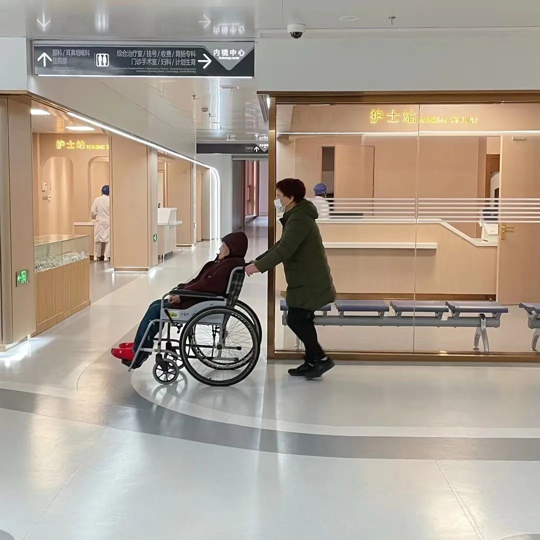
室内设计充分考虑医患的就诊体验,在主要的公共空间,嵌入直饮水机与充电宝租借位;视线无阻的环绕式护士台,造型独特,便于给患者更好的识别,空间的转角与台面进行柔性处理,尺度舒适,光线明亮的细节设计,也给医护人员更多的关心;廊道中各功能空间的标志也做了可更换式处理。
The majority of the patients served by the Anda Hospital are community residents. The improvement of the quality of hospital space needs to be embodied in humanized details. For the convenience of patients, each waiting room is designed with a built-in direct water dispenser; a place for renting and charging equipment is provided in public space; each corner is softened with an arc to avoid patients being knocked; a unique shape of nursing table not only make it easy for patients to locate, but also protect the safety of nurses in their work.

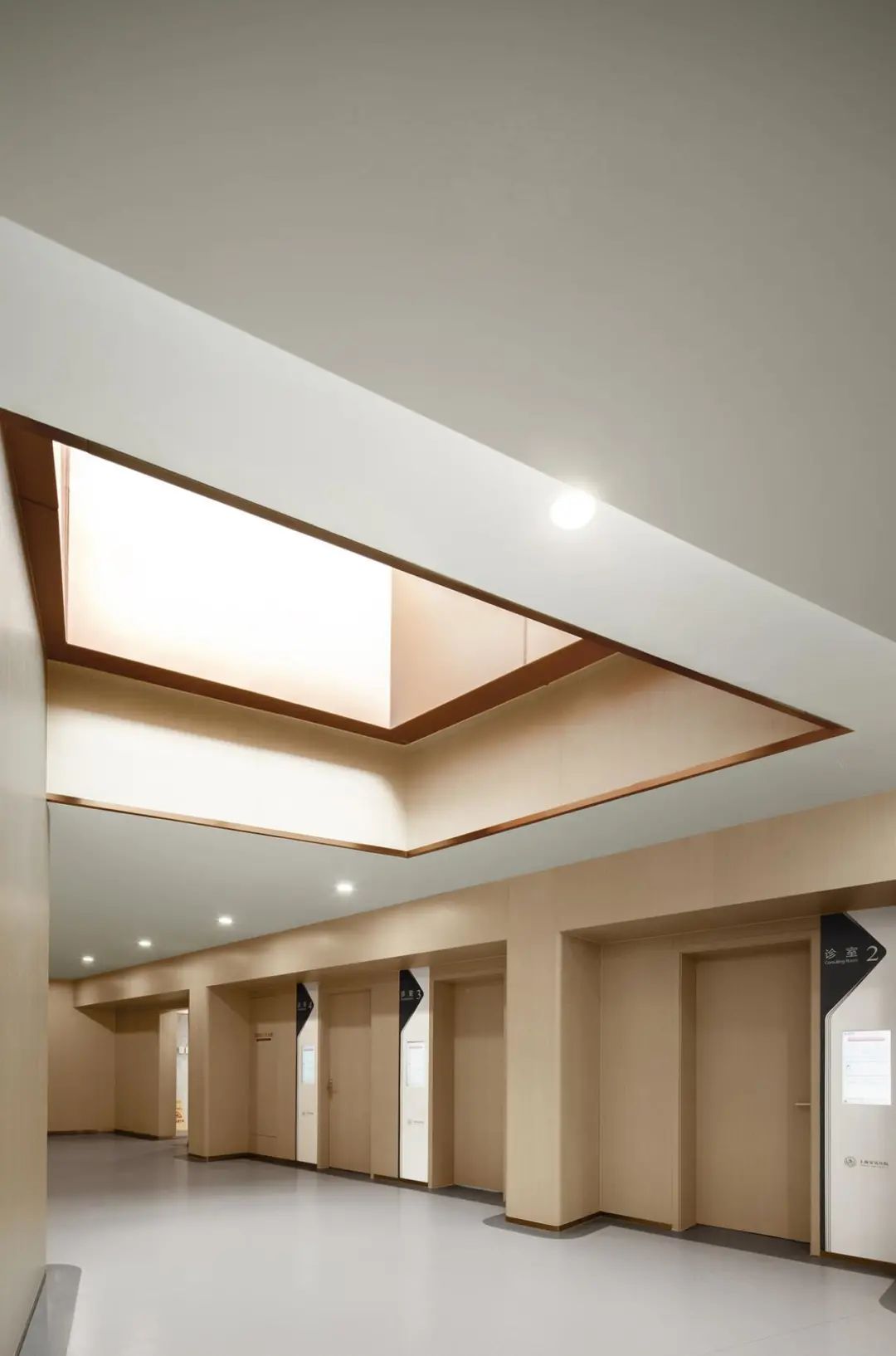
在空间氛围的营造上,室内空间采用冷暖结合的方式,白色的灯光、顶面与地面突出医院的洁净感,点缀暖色调不锈钢金属型材,凸显医院温馨、自然放松的氛围。
In terms of space atmosphere, the design aims at warmth, comfort and simplicity. Unlike general hospital interiors which are mainly made of cold tone, Anda Hospital's interiors use a combination of cold and warm. The white lighting, top surface and ground highlight the cleanliness of the hospital. The warm-toned stainless steel metal profiles are embellished to highlight the warm, natural and relaxing atmosphere of the hospital.


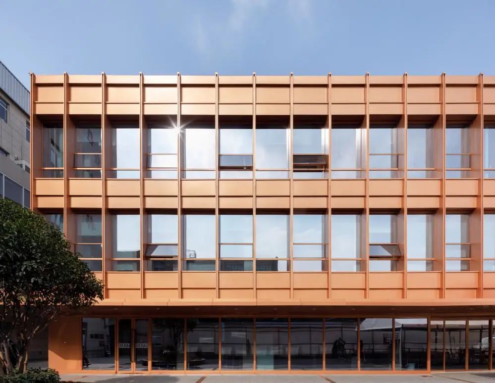
在外立面的设计中,主体选择与住院部颜色相近的米黄色材料统一医院的形象,结合铜色金属铝板打造标志与特色,凸显建筑张力;为了纪念原有的青砖式建筑,设计保留建筑坡屋顶形态与沿街三角庭院,采用青砖纹样式穿孔铝板作为建筑的立面。
The new building adopts Spanish cream-color limestone as its exterior material, which is similar to the exterior of inpatient department. The copper-colored aluminum panels decorated on the wall make it different from the First Women and Children's Hospital nearby, forming a unique image of Anda Hospital which is also easy for way finding.
结语
Conclusion
整个改造过程中,安达医院没有歇业过一天,新⻔诊楼竣⼯的第⼆天,就投⼊使⽤,真正做到了无缝衔接。项目交付后,我们又进行了多次的回访,得到最多的反馈是:整体形象、品牌感和标志性强了;空间更加宽敞,出入口和内部流线清晰明了,效率与品质也得到了提升。
During the entire renovation process, Anda Hospital has not closed for a day. After the outpatient and emergency building was put into use, we conducted several return visits to ask the opinions of patients, doctors and hospital administrators. The most common feedback is that the overall image, brand sense and logo are strong; the entrances and internal flow are streamlined; The space is more spacious; the efficiency and the quality of the space are improved.


回访中,经常看见住院部的家属推着的老人在医疗街二楼散步,在窗口看夕阳。患者和家属能够在这里感到舒适和放松,是我们设计师最大的欣慰。
During the return visit, I often saw the elderly pushed by the family members of the inpatient department walking on the second floor of Medical Street, watching the sunset from the window. Patients and their families can feel comfortable and relaxed here, which is the greatest comfort of our designers.
工程信息
项目名称: 上海安达医院
设计单位:戴文工程设计(上海)有限公司
公司网站:www.dpall.cn
联系邮箱:guo.guo@dpall.cn
设计时间:2016年6月
建设时间:2020年10月
建筑面积:6200平方米
主创建筑师: 邓琳爽,王致尧
设计团队:建筑:丁涛,徐鹏,郭心仪
室内:邰燕荣,李金环,薛春杰,张亚辉
设备总负责:贾晶(暖通)
水专业:唐元
电气:郑伟
结构:毕圣松
建筑摄影:存在建筑摄影
上一篇:诸暨市妇幼保健院